
Adapting an existing website to a Modern Application
This post explores some of the design challenges in adapting an existing website to a touch-first modern application. While the focus is the Windows 8 design language, most of these points are also applicable to Windows Phone 7/8, and the basic principles apply to other platforms such as iOS or Android as well. The website I use as an example is the BoardGameGeek site, which is a niche online community dedicated to board games.
Step 1: Understand the brand/product
The first step in adapting an existing property to a new medium is to understand it’s current form. This requires that you break the brand down:
- What is the product? What are it’s strengths? What are it’s weaknesses?
- What is the audience? What is the brands broader audience? Will your app target the whole population or a subset?
- What is it’s visual style? How is the brand expressed visually? What is the essence of it’s style, Does it have an iconic logo? Does it have a unique color palette? How is typography used? Does it use shapes, texture or whitespace in a unique way?
It may also be beneficial to research competing products, find related research results, or conduct surveys of your own to better understand the product landscape.
Example: Analyzing the BoardGameGeek brand
Product summary: BoardGameGeek is by far the largest website dedicated to board games. It is focused on the strategic or “euro style” board games which have become increasingly popular in the last 10 years. (Popular games include Settlers of Catan, Ticket to Ride, Carcassonne and Agricola.)
The website has a dedicated page for each game, which showcases basic details such as the designer, year released, playing time, number of players, recommended ages. They allow members to upload photos and videos of the game, describe different editions of the game, and share files such as rules, player aids, and fan-made content. Each game is also given a dedicated forum where fans can offer reviews of the game, discuss strategies, clarify rules and other topics.
Each game is given a prominently-displayed ranking based on the ratings provided by members, and these rankings play a major decision in the purchase decisions of many gamers. It is likely that a game’s rating on this site is one of the most important factors in it’s long-term success, making this one of the most impactful contributions the site offers to the broader community. There are tools to search for a particular game or browse the large game database in many different ways.
Beyond all of these resources for each game, the site offers many other features competing for a visitors attention. There are additional forums to discuss broader gaming topics, the ability for members to define “geeklists” which are collections of games with notes explaining how they relate, the ability for members to create a blog to discuss gaming topics, the ability to sell your games and see relevant ebay auctions, as well as arrange trades.
Lastly, there are many tools for members to keep track of their own board gaming experience. Members can keep track of which games they want, own, how much they paid, which edition they have, their rating for each game, personal and public notes and more. You can even record an entry for each time you played that game, allowing you to see which games you play most frequently.
Audience: The site has two audiences with very different needs. Because it is the biggest community dedicated to board gaming, new players are likely to discover the site by accident through a search engine. Existing fans will come back to the site daily to catch up on new games, participate in discussions about their favorite games, update their collection or record a game they just played.
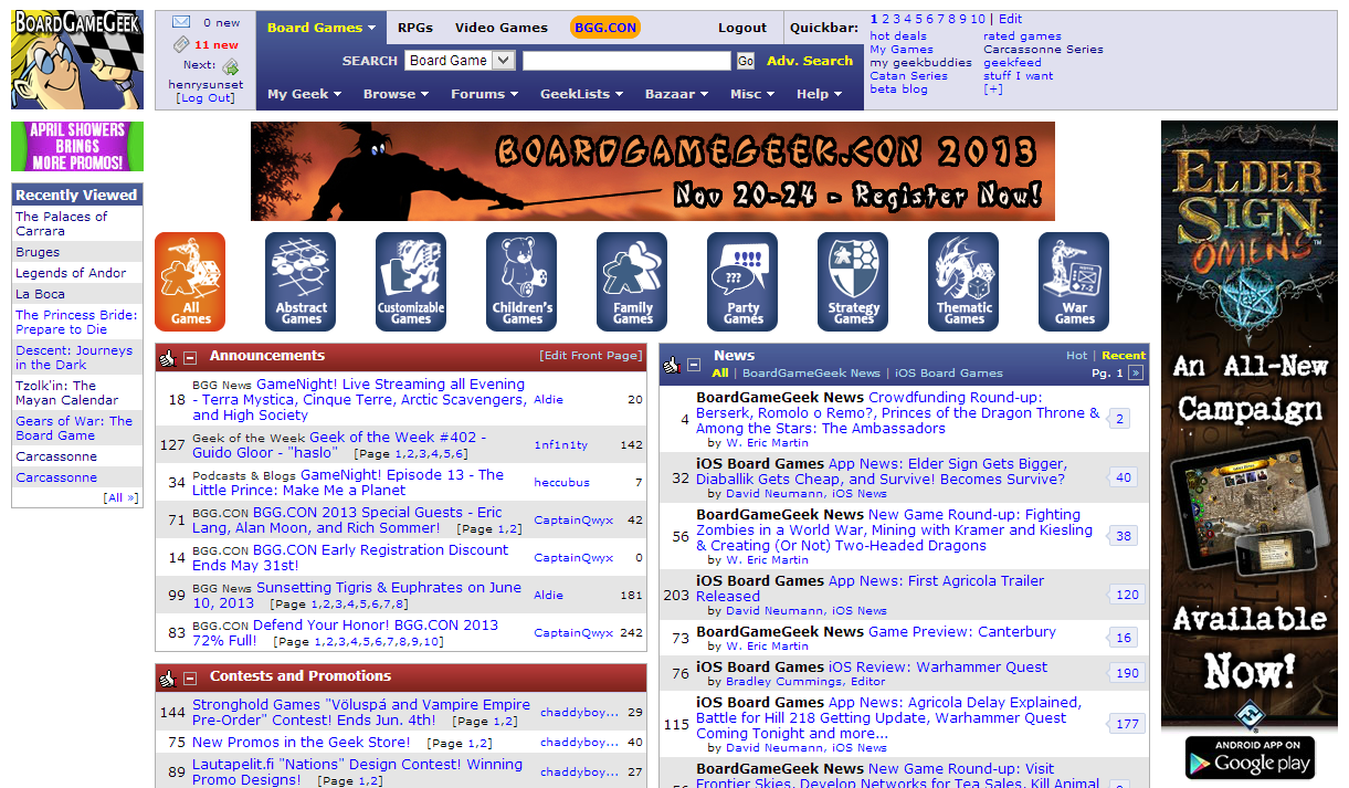
Visual Style: The site has existed for a long time and the design reflects this. The appearance is very dated, leveraging tables extensively to arrange items on screen without any whitespace; it looks like many sprawling sites designed in the late 90’s. Because the site was built a little at a time, the navigation system is an overwhelming combination of links, tools and dropdown menus that wrap around both the top and left side of the screen, and are difficult to navigate using touch. The homepage is a wall of text with a few small images, and everything is presented at equal visual weight. It is hard to tell what is most important in the design, and very difficult to learn. The color palette also feels dated, leaning heavily on a navy blue color which is reminiscent of the early days of the web with a mix of other blues, oranges, yellows, greens and greys used as accents. (Active users visit the site despite it’s poor design.)
Step 2: Establish your perspective
After you have a good understanding of the source material, it is time to establish your perspective. When adapting content to a new medium such as touch, you will want to be disciplined and focused. By reducing the brand to it’s essence, you can re-adapt it more easily.
Some tips in establishing a clear perspective:
- Can I further scope my audience? Focus can give you the freedom to reduce complexity and build something useful more quickly.
- What is the smallest thing I can build that’s useful? Finishing something small and useful can give you the momentum to build something bigger.
- how do I want to reflect my app/brand visually? You should be able to describe the visual style using emotional words like “light”, “simple”, or “powerful”.
Example: Proposal to create a BoardGameGeek app for Windows 8
Features: The BoardGameGeek site is all about games, and a mobile application should put games first too. Community-generated content, forums and lightweight social networking support this central focus, so these features should largely appear in context to the games themselves. The lightweight social networking and communications features should appear as secondary options within the design.
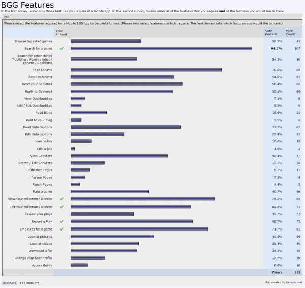
I conducted a casual survey to better understand the most important parts of the site to Mobile users: http://boardgamegeek.com/article/11546391
While it would be great to enable all of the scenarios supported by the website, it is necessary to focus on a few scenarios for an initial implementation. That said, additional functionality would increase the value of the application for some users. In analyzing the results and see that scenarios involving reading information from the site was generally more important on a mobile device than features to reply to discussions and contribute to the site. The one exception was the desire to quickly record a game you just played, which fits in perfectly with a mobile device context.
The following features are required for the app to be of use to most users:
- Search for a game, learn basic info about the game, and read the rules.
- View the list of games that you own / wishlist.
- Read forums where members discuss gaming topics or a particular game.
- Log that you have played a particular game.
Additional capabilities should be added in the following order after an initial release:
- Browse top rated games.
- Edit list of games you own / wishlist.
- Ability to reply to forum discussions.
- Read and reply to Geekmail.
- Read geeklists.
- See new content you have subscribed to. (requires support for all content types you can subscribe to)
- Access more detailed content about games such as photos, videos, download files.
- View other content types such as Publisher, designer, family pages.
Target Audience: As this app will be a companion to the website, it can be targeted at existing users who are familiar with the information and capabilities of the existing website. As such, the app should be designed to encourage users to sign-in to access their collection of games and contribute to discussions. Our focus on existing members allows us to leverage the site’s custom vocabulary with less concern. (ex: Geeklists, Geekmail, Wishlists)
While the underlying site would likely benefit from less features with more approachable names, it is not desirable to introduce arbitrary new terms in an app meant to complement an existing webpage.
Design goals: The visual style of the existing website presents a challenge as it is very dated, very dense and very hard to use. The color palette is dated and inconsistent, it uses gradients extensively which do not align with a modern style, and the website’s icon doesn’t align with modern sensibilities. It makes sense to let go of the existing icons and overwhelming design by reinterpreting the brand using strong typography, a refreshed color palette and a looser layout that leaves room to breathe and is easier to use with touch.
While use of several bold colors is prevalent in many modern apps, I would recommend a modest palette to allow photos of your games to be the strongest elements in the design.
Step 3: Design the experience
Once you have established your perspective for the project, it is time to design the experience, and help it get built. There are at least two parts of the design process which will apply in a project like this:
- Interaction Design: How will the app work? What is the visual hierarchy of the app’s capabilities? How do you navigate between different parts of the experience?
- Visual Design: How will the app look and feel? How do you adapt the high-level design goals into a crisp finished product?
In many cases, you will need to tackle both of these problems yourself. While it is out of the scope of this article go into details of the design process, I will offer a few quick tips:
- Finalizing the Interaction design is easiest with low-fidelity prototypes such as hand drawings or PowerPoint illustrations The goal is to rapidly explore multiple designs to arrive at the best solution for the whole app, not just a single page of the experience.
- Finalizing the Visual design is often easier to do after completing the rough interaction design. When finalizing the visual design, I have found that it is best to focus on just a couple key experiences, then extrapolating those design decisions across the rest of the app experiences.
In some large organizations, there are separate people who focus on Visual Design vs. Interaction Design, a distinction which I support from my own professional experience. The skills which make a person excellent at solving complex interaction design problems involve big-picture thinking and an understanding of a user’s path through many different areas of a product. By contrast, Visual design is focused on making things beautiful, elegant and simple – reinforcing an emotional story which the product tells when you see it and use it.
Example: Designing a BoardGameGeek app for Windows 8
My final proposal is a PowerPoint document which I shared with the developer building the app. I am very familiar with PowerPoint, which allowed me to iterate rapidly through several design iterations. (I believe that a PowerPoint document can be used as a specification, as long as the designer is working closely with the person who will implement it.)
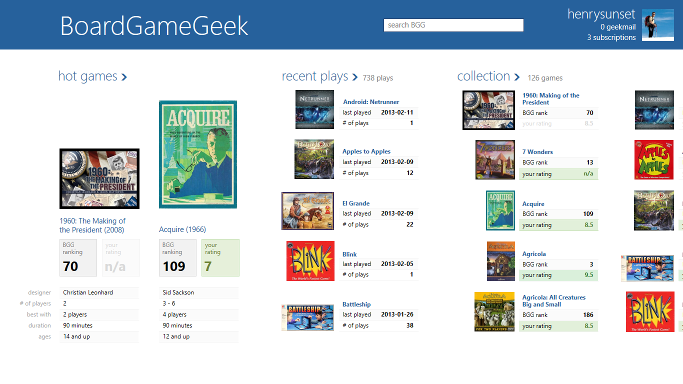
Final proposal for home page of the app.
The final design proposal retains the BoardGameGeek website’s use of blue with a white background, but I shifted from a navy blue to a fresher, brighter blue. I preserved black and grey text for readability, and used occasional green accents as needed (instead of a wide array of accent colors used throughout the website). I used the iconic board game cover art images as a central element in all pages of the design.
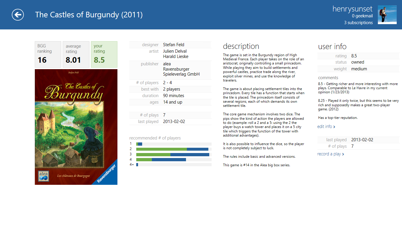
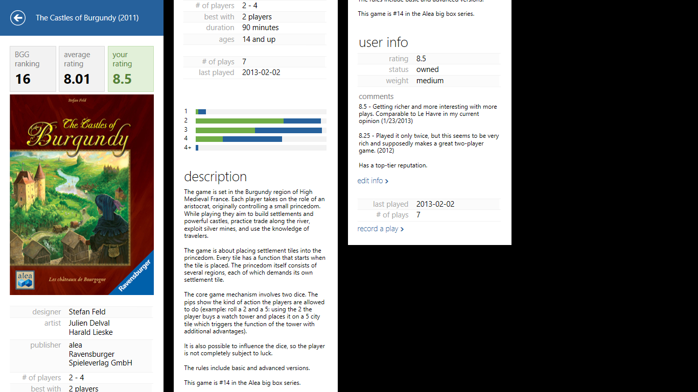
Details page for a single game
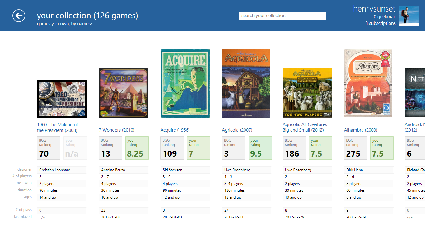
Gallery showing several games you own
Behavior when app is snapped to the side, also applicable to adapt the app to Windows Phone UX.
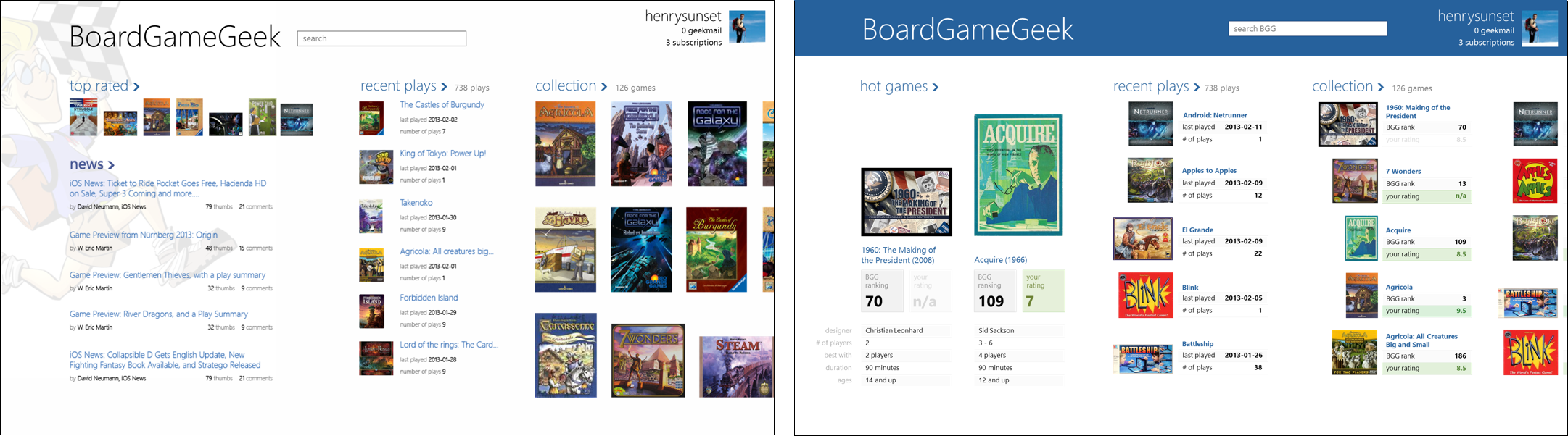
You can see the visual design process by comparing an early visual design exploration (left) with the current design proposal (right).
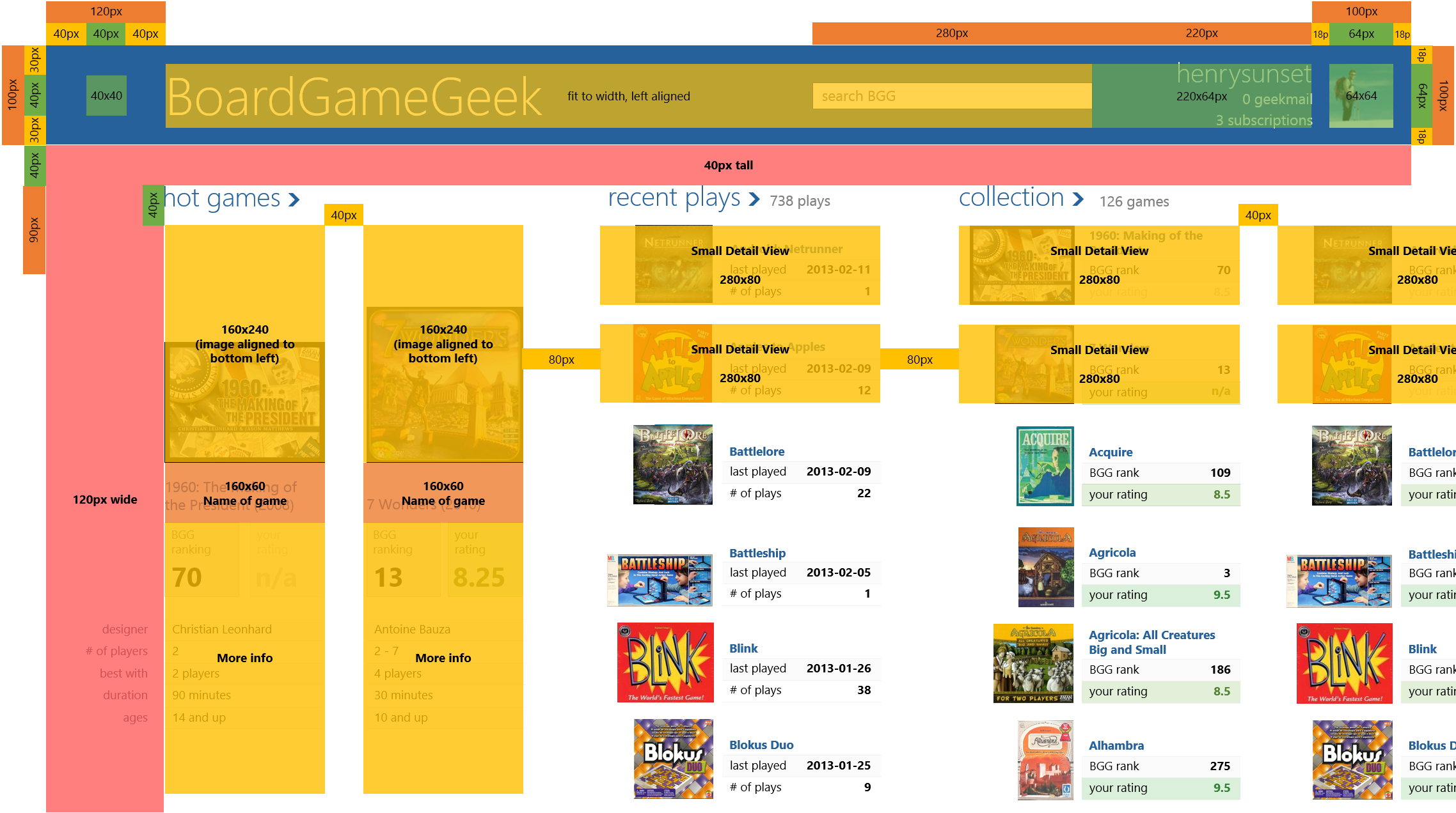
A detailed wireframe diagram showing pixel measurements of the position of UI elements is a great way to make sure the final app matches your vision for the design.
Step 4: Get it built
In my case, I was lucky enough to have a developer already working on a BoardGameGeek app, and he was very receptive to my design recommendations. The results of our collaboration is a “work in progress”, which don’t yet meet the design fidelity described in this blog post. That said, the app works pretty well, allowing you to view your collection, learn about games, and record a game you just played. Learn more and download the BGG Companion app for Windows 8
Unfortunately, the developer who began the project is unable to continue working on it at this time. He was willing to share his progress with others, in the hopes that others will continue where he left off. If you are a developer looking to help improve the app, you can get involved at https://github.com/WebKoala/W8BggApp. Please let me know so I can provide the current detailed design documents, help test new features and answer questions!
 TOM ALPHIN builds
Thanks for your design work. The app really looks great and is pretty useful. I hope some other developers are able to bring this app to its full potential.
This proposal looks awesome. I was thinking of developing a similar BGG based app when I’ve found the one created by ‘WebKoala’ and since this one is already on Github I’d love to help with the development.
Yes, you should get involved.
I am happy to provide continued design guidance and beta testing to anyone who wants to contribute!