Posts Tagged ‘Cartography’

The National Park Checklist

October 11th, 2009

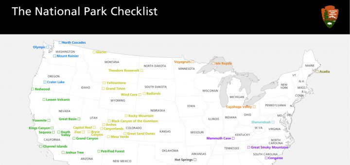
I worked on Amy’s birthday present for about a week, using source material from the National Park Service to create a detailed map and checklist of the 58 National Parks administered by the National Park Service.  We have said that it is a goal to visit all of the National Parks, and now we have a way to keep track!

I tried a few ways to keep track, including a small map with a list of parks that you check off in a separate list below, but I thought it would be more fun if you physically “x” off the parks right where they exist geographically on the map.  I started with this map that contained small dots at each site, and a simple text label.
From there, I removed everything but the 58 actual National Parks, put a checkbox where the dots were, and I color-coordianted the text and boxes to the 9 National Park Regions described in the Passport to your National Parks cancellation book.

To finish it off, I added the standard black National Park Header, and an alphabetical list beneath the map which allows you to record when you first visited the park.

I had initially designed it to be printed on our 13×19″ capable Canon Pixma Pro 9000 Inkjet, but decided to try Costco, which will print a 20×30 print for just 8.99$.  I found reaosnably priced 20×30 frames at Ben Franklin, and I found really convenient adhesive foam core in conveniently enough, 20×30 pieces for 6$ a Michaels.
I am really happy with the final result, which looks really classy in the black frame.  It served as a great conversation piece during Amy’s birthday party, althought we still need to check-off the 11 parks we have visited together.  And, I think she liked it!

The story behind the glossy National Park Brochures

October 5th, 2009
In traveling parts of the United States during the family road trips of my teenage years, the maps and brochures from the National Parks were always interesting to me.  They were of consistently high quality, contained interesting information, arresting photos and featured detailed maps with were both accurate (like the USGS topo’s I had some familiarity with) and had a level of finish quality and artistry that draws you in.
The high quality brochures are not a coincident, they are the result of a long-standing commitment “to create media that effectively communicates National Park Service messages to the public.”  It turns out that “since 1977 the designs of all new brochures have been based on the ‘Unigrid System’ format, created by designer Massimo Vignelli in collaboration with” the park service.  The design only offers sizes which can be printed and cut to evenly divisible sizes based on the large sheets of paper they order for publishing.  I believe that the largest map they produce (B6 in the image below) is 1/4 the size of the paper they use.  Thusly, B4 is 1/6th, B3 is 1/8 and so forth.
The park service offers detailed guidelines for developing literature based on their strict but effective grid system.  They also do most of their high-end mapping and brochure design in a single central office in Harper’s Ferry.

Revised map of Glacier Bay

A specific in-depth article by the National Park Service describes the creation of a new National Park Brochure for Glacier Bay National Park. The article calls out that to make the map, their team collected ”input from staff at the park”  They further went on to describe their research into the primary usage for this map: ”Ninety five percent of visitors to Glacier Bay arrive on cruise ships, never set foot ashore, and are older than the general population of park visitors—thus, large map type is a design necessity.” They also call out “observing visitors using the map”.  Further, the map was not made by just one person, but “a collaborative effort between a writer, graphic designer, and cartographer”. 

It is interesting to see how the project managment of a detailed map is so similar to the process we use in building software.  Research, planning, development, research and refinement are the same steps we follow.

I also learned more through this article about the purpose of each side of the maps that they create.  “The front side of the brochure, which includes the cover, is generally devoted to introducing the park and outlining broad interpretive messages by means of photographs, illustrations, text, and the occasional small thematic map. The second side of the brochure, containing practical visitor information including the map, is more subject to change.”  I did not realize that they deliberately separated the content by sides based on the likelyhood that the information would need to be updated.

Further Thoughts:

  • Since the park service is a government agency, everything they do is in the public domain.  They offer the illustrator/photoshop files for all of the national park system maps free to download.
  • A review of the Unigrid system.
  • I am amazed, but I cannot find anyone on the web that specifically collects national park maps/brochures.  I thought someone out there collected everything.